Every road sign in the United States speaks a coded language before a driver reads a single word. The color tells you what kind of message it is, and the shape reinforces it so the sign registers even at a glance, at speed, or when the face is half-covered in snow. That code is not decorative. It is defined in the Manual on Uniform Traffic Control Devices, the federal standard now in its 11th Edition, and understanding it is the difference between ordering a sign that looks official and ordering one that actually communicates the way drivers are trained to expect.
If you are speccing custom road signs for a private community, campus, work site or parking facility, this is the framework that keeps your signs legible and consistent with what people already recognize from the public road.
Color carries the category
The MUTCD assigns each color a single, specific job, and it does not reuse them loosely. Red means stop, yield or prohibition, and it is the most restrictive message on the road. Yellow is permanent warning, the color of a hazard that is always there such as a curve, a merge or an intersection ahead. Orange is reserved for temporary traffic control, which is why work zones and detours look different from the permanent signs around them. Green is guidance and permitted movements, the color of directional and destination signs. Blue marks motorist services and evacuation routes, brown points to recreational and cultural destinations, and white is the standard background for regulatory signs, with black as the legend and border color that provides contrast.
Three of the colors exist for specific modern uses that are worth knowing. Fluorescent yellow-green is the high-visibility color for schools, pedestrians, bicyclists and playgrounds, chosen because the human eye picks it up faster in peripheral vision. Fluorescent pink is for incident management, the unplanned scenes around crashes and emergency response. Purple designates electronic toll collection lanes. Two more, coral and light blue, are held in reserve for future assignment and should not be used. The chart below lays out the full working palette and the meaning locked to each color.
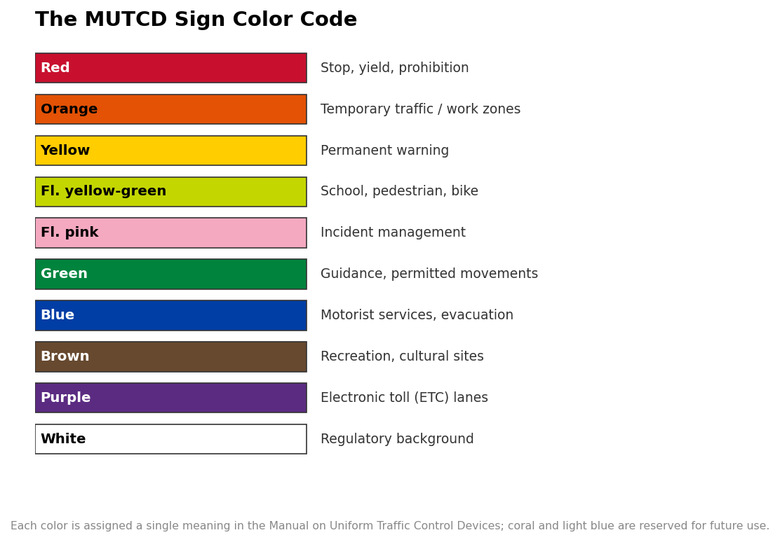
The practical takeaway for a buyer is that color is not a styling choice. Printing a warning message on a green background or a regulatory instruction on yellow does not just look wrong to a trained eye, it undercuts the instant recognition the whole system depends on. When you specify a custom sign, start from the message category and let the standard color follow.
Shape is a second, redundant signal
The MUTCD backs up color with shape so that a sign stays readable when color fails, at night, in bad weather, or when the face is dirty or faded. Several shapes are reserved so strictly that the outline alone tells you the message. The octagon is used for one sign and one sign only, the stop sign, which is why its silhouette is recognizable from behind or when snow obscures the lettering. The downward-pointing triangle is likewise reserved exclusively for yield. The pennant, a horizontal triangle pointing right, appears only on the no-passing-zone sign, and the round shape is reserved for the railroad advance-warning sign.
Other shapes signal a whole category rather than a single sign. The diamond is the general warning shape for the entire W-series, yellow for permanent hazards and fluorescent orange in temporary work zones. The vertical rectangle is the default for regulatory R-series signs, covering speed limits, no parking, one way and turn restrictions. The horizontal rectangle is for guide signs showing destinations and distances, and the point-up pentagon in fluorescent yellow-green marks school zones and crossings. The reference below shows the reserved shapes and what each one is limited to.
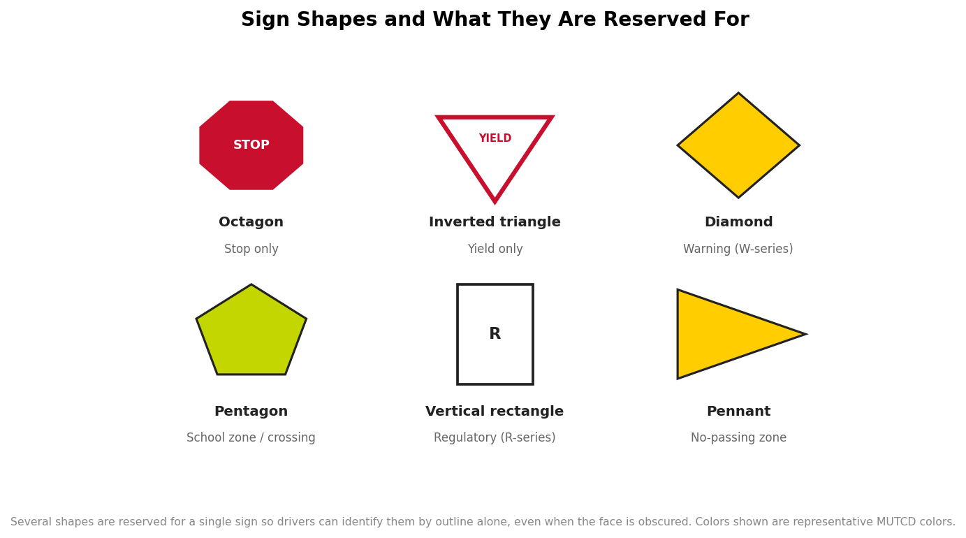
This redundancy is the quiet genius of the system. A driver does not have to consciously decode anything; years of exposure have trained the response so that an octagon reads as stop and a yellow diamond reads as caution before the words are even processed. When your custom sign follows the same shape logic, it inherits that trained recognition for free. When it breaks the logic, using a diamond for a regulatory instruction, say, it forces drivers to actually read and interpret, which is exactly what a good sign should not require.
Why this matters for private and custom signs
A common misconception is that the MUTCD only governs public highways, so anything goes on private property. In practice, that is a mistake worth avoiding on two fronts. First, drivers do not switch mental models when they pull into a private lot or a gated community; they carry the same trained expectations, so a sign that violates the color-and-shape code is genuinely less effective even where no one is enforcing a standard. Second, in many situations, private roads open to public travel, and certain parking and fire-lane signage tied to local codes, jurisdictions do expect MUTCD-consistent signs, and non-compliant signage can undercut enforceability if a citation or liability question ever arises. The safe default is to match the public standard unless you have a specific reason not to.
So when you order, work from the message outward. Decide the category first: is this a regulation drivers must obey, a warning about a hazard, or guidance toward a destination? That single decision sets both the color and the shape, and from there the specifics such as legend, size and reflective sheeting follow. A stop control is a red octagon, full stop; a hazard is a yellow diamond; a rule is white-on-black in a vertical rectangle; a direction is white-on-green in a horizontal one.
Get the code right and the sign does its job
The color-and-shape system exists so that a sign communicates in the fraction of a second a driver has to take it in. That is a higher bar than looking professional, and it is one a custom sign clears only by respecting the same coding the public road uses. Match the color to the message category, match the shape to the message type, and reserve the single-use shapes for their one purpose. Do that, and your signs will read the way drivers already expect, which is the entire point of a standard built on uniformity. The specifics here reflect the current MUTCD framework; for a sign tied to a code requirement or a specific jurisdiction, confirm the exact designation with the authority that has jurisdiction before you finalize the order.